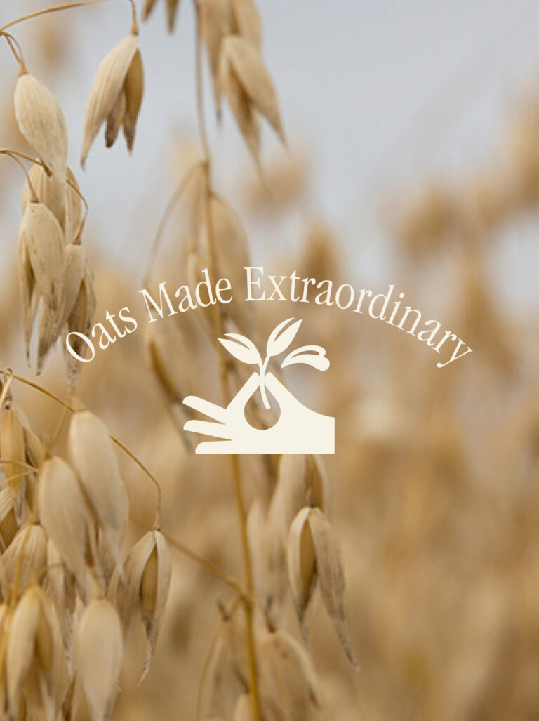
Oats Made Extraordinary
Founded by Tom Mercer in 2006, MOMA quickly became a standout challenger brand in the porridge market, thanks to its focus on high-quality British jumbo oats.
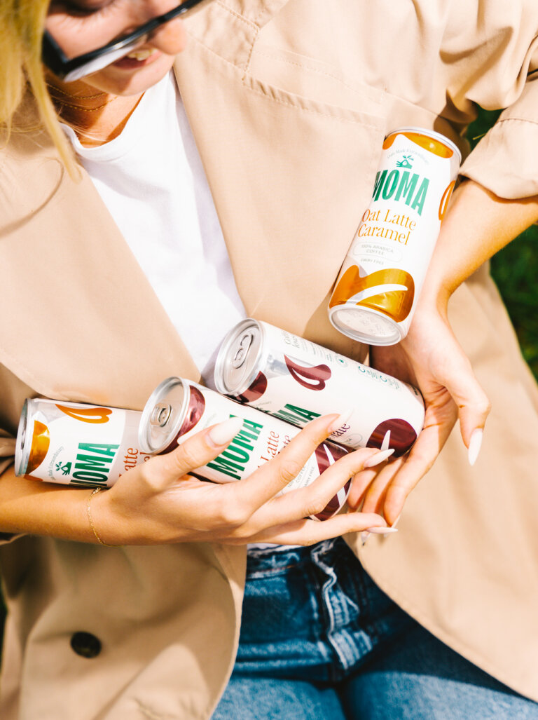
Over the years, MOMA has expanded into the fast-growing plant-based milk market, after testing over 250 recipes and perfecting the formula for its Barista Oat Drink. Today, MOMA is the UK’s third-largest oat milk brand, a huge milestone in their journey.
After 18 years it was time for a refresh. MOMA wanted to stand out even more, not just as a porridge brand, but as the go-to oat drink that’s both delicious and nutritious, to better connect with today’s consumers.
We teamed up with Think-kwad to conduct extensive shopper research, which revealed significant ‘category confusion’ among consumers. Many products appeared to serve similar needs, leading to uncertainty around health benefits and taste credentials.
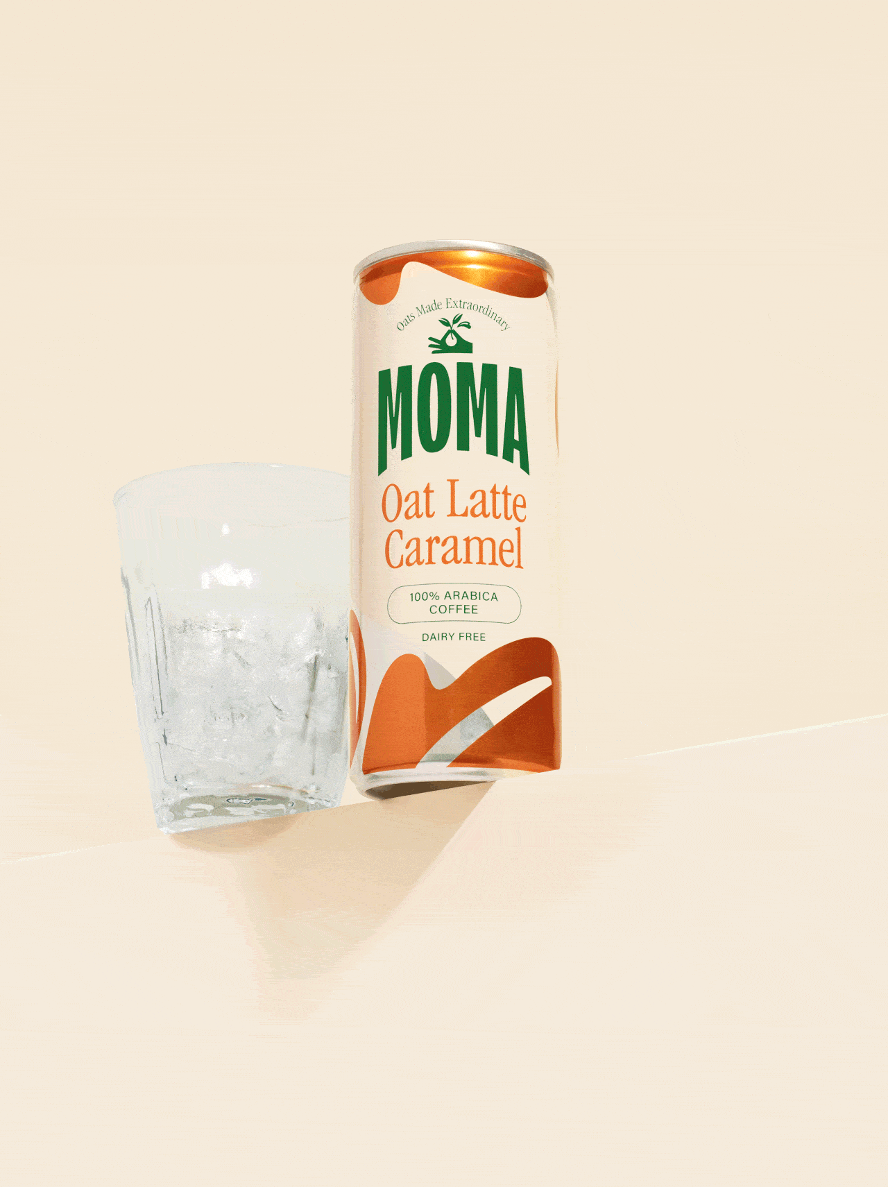
Our consumer insights informed MOMA’s new brand strategy. The new positioning was all about elevating the humble oat: perfecting its taste, texture, and versatility, while highlighting the health benefits of oats grown locally in the UK. This led to MOMA’s new tagline: ‘Oats Made Extraordinary’, which is accompanied by an illustration of a hand holding oat grasses, symbolising the craftsmanship, commitment, and attention to detail required to transform the humble oat into something extraordinary.
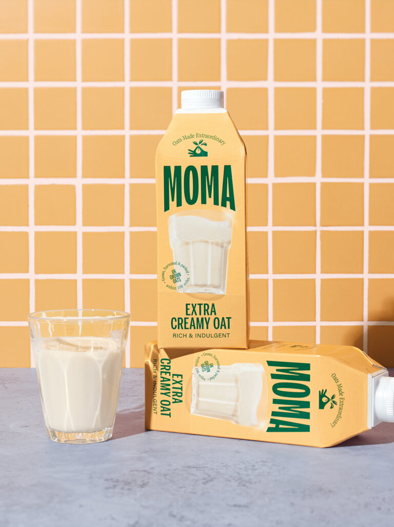
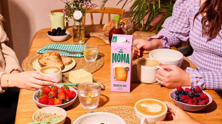
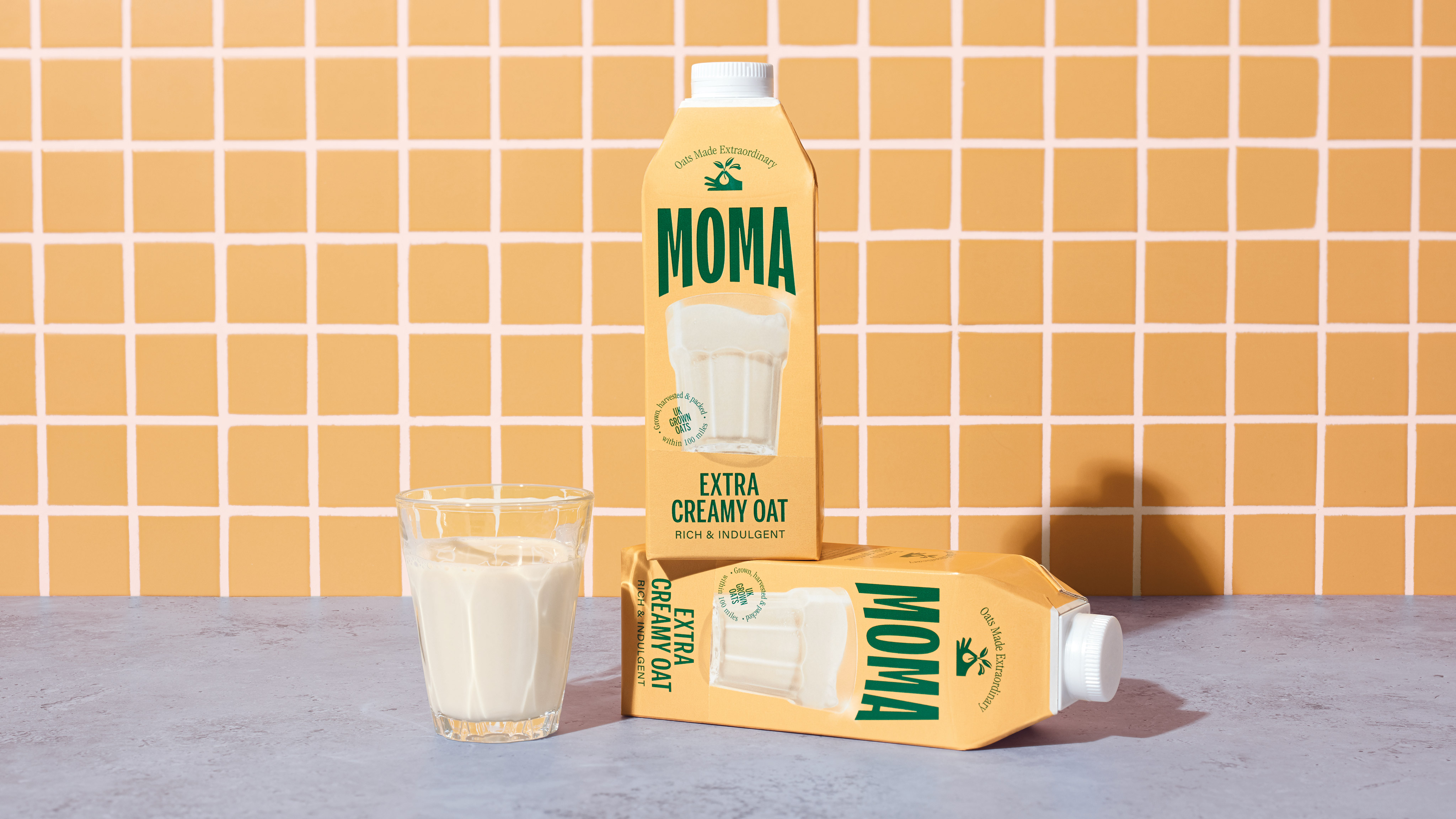
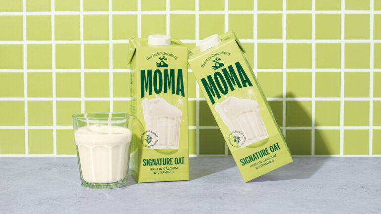
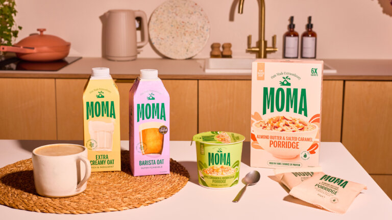
To emphasise taste, we showcased a delicious oat drink on a plinth at the forefront of the packaging. This not only created an iconic look but also made it easier for consumers to identify and shop the category.
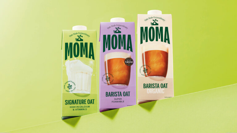
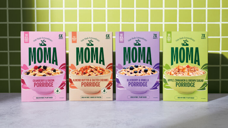
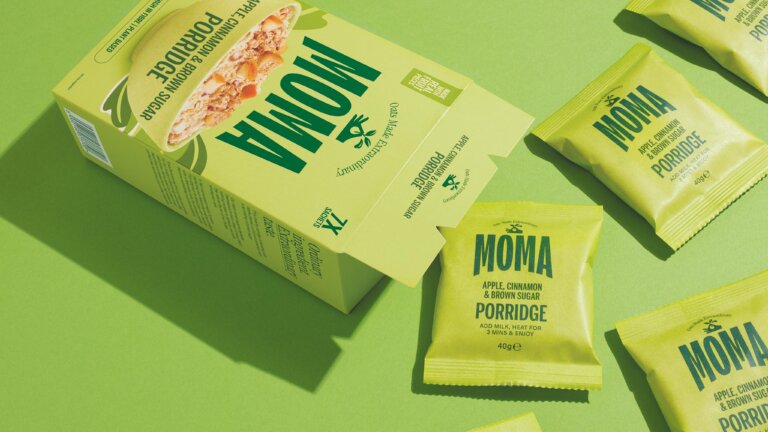
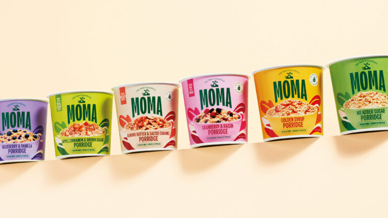
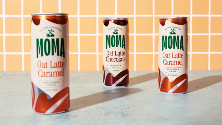
A fresh and healthy primary color palette of greens and cream was introduced, complemented by a product-specific color palette that reflects the flavor of each item while aligning with MOMA’s signature dark green.
We also introduced a farm-to-pack promise on the front of each pack. MOMA’s oats are grown, harvested, and packed within 100 miles of the company’s base in the UK, ensuring drinks that are creamy, well-rounded, and full-bodied. This message is further detailed on the side of the packs.
"Together Design London's creativity, expertise and collaborative spirit made all the difference."
Share this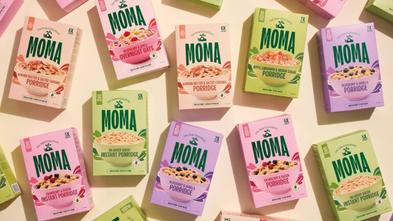
A flexible identity
We worked closely with the MOMA team to deliver a flexible brand identity that spans digital and offline platforms. Our work included crafting a new brand logo, strapline, and brand mark, as well as establishing a cohesive color palette, tone of voice, digital content, iconography, photography, social media assets, full packaging range, POS and FSDUs. Our comprehensive brand guidelines and design system have enabled the MOMA team to roll out the refreshed brand across all touchpoints, ensuring a consistent and engaging brand experience.
A Harvest of Flavour
Jeni’s Ice Cream X Bridgerton
Enjoyed this article? We also post our articles on LinkedIn. Follow us to stay up to date.
Follow us on LinkedIn