Rebranding
natural skincare
Liz Earle
Rebranding the UK's No1 natural skincare brand.
The Solution
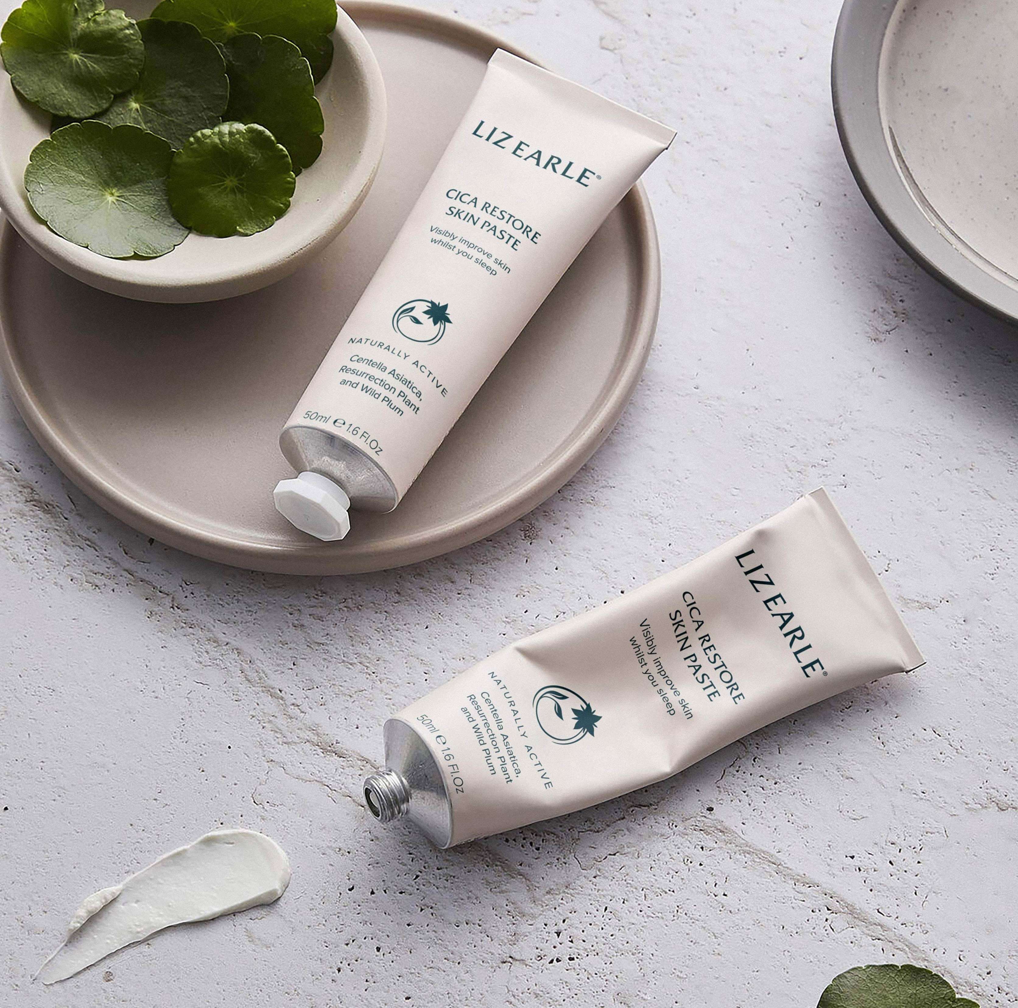
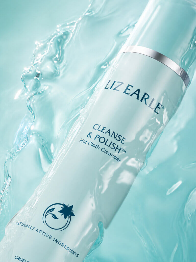
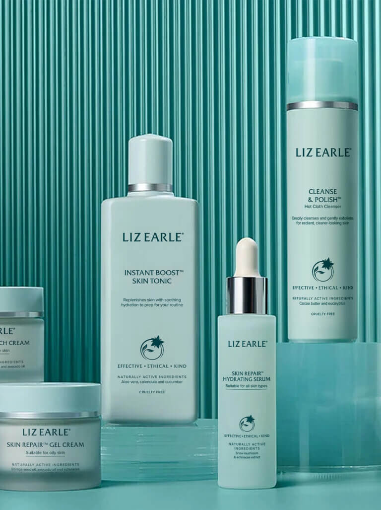
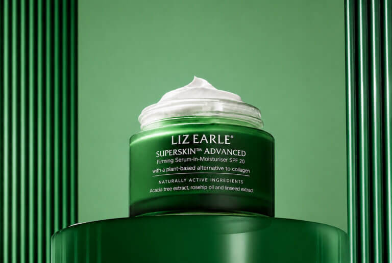
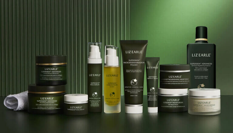
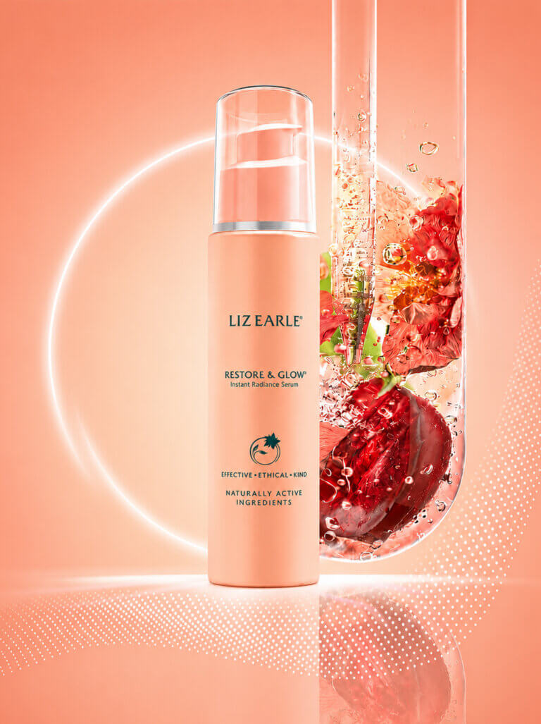
We undertook a full rebrand of the Liz Earle product portfolio, restructuring the core range to establish a clear product hierarchy and introduce new segmentation. The redesign improves product navigation and creates a consistent and engaging on-shelf presence. Drawing inspiration from Liz Earle’s Isle of Wight heritage and dedication to natural ingredients, we refined the colour system across the range: a rich dark green was introduced for the Superskin anti-ageing range, complementing the soft pastel green of the iconic Cleanse & Polish line.
Sustainability was embedded into the design process. We supported the brand in exploring innovative sustainable packaging solutions, resulting in the adoption of 100% recyclable tubes made from 55% post-consumer recycled materials.
The Impact
The rebrand has transformed Liz Earle’s core range into a more cohesive and navigable product portfolio, enhancing on-shelf standout and reinforcing the brand’s natural, premium positioning. The new colour-coded segmentation creates a clearer visual hierarchy, making it easier for customers to shop the range while strengthening brand recognition across categories.
We continue to collaborate with the team on Liz Earle’s gifting ranges each year, ensuring the brand remains both seasonally relevant and unmistakably Liz Earle.


Caffè Nero