Logic not miracles

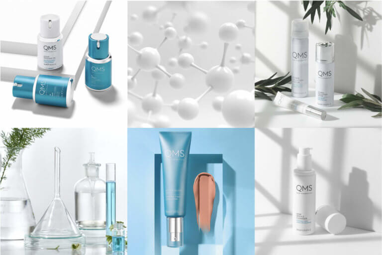
German skincare brand QMS Medicosmetics has, over the past 30 years, built a fiercely loyal and global customer following thanks to their clinical expertise and innovative products. Firmly established in the European Spa market and with a successful presence in Liberty London, new owners Blue Gem felt there was an opportunity to reposition and repackage the brand to expand the consumer brand and open up new retail and online channels, in both existing and new regions.
A culmination of qualitative interviews with internal and external stakeholder groups, store visits, a product and packaging audit, and an extensive market review helped us to define the priority consumers and the strategic brand pillars for the business, and it was clear that QMS needed to work much harder as a brand. It needed greater presence on shelf, clearer product hierarchy, and as a premium offering, it needed a look and feel that aligned with its product positioning and price point.
We devised naming and descriptor principles in order to help customers to better navigate the range and provide greater confidence for self-selection. As our research showed considerable equity in the QMS blue and confidence in the brand’s scientific heritage, we created a look and feel that reflected the clean, clinical core of the products while retaining a recognisable legacy. Extending the colour palette to include tonal variations of blue provided points of intrigue and differentiation across the identity and social media, POS and packaging.
Our aim was to balance cutting edge clinical expertise with the elegance and luxury of classic beauty, bringing to life the brand promise of Logic not miracles so that QMS can continue to expand its following and global reach for years to come.
Enjoyed this article? We also post our articles on LinkedIn. Follow us to stay up to date.
Follow us on LinkedIn

