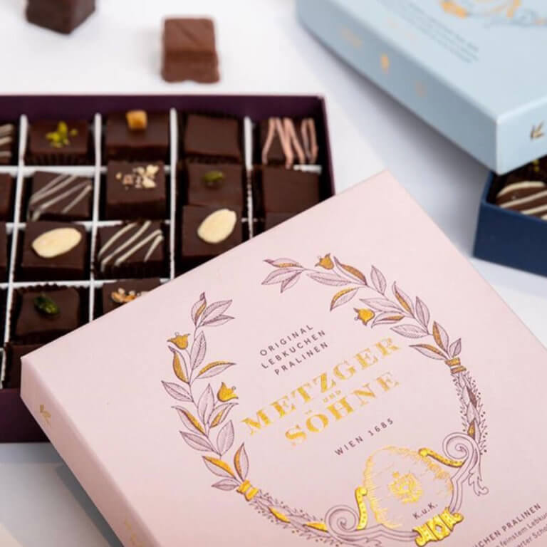
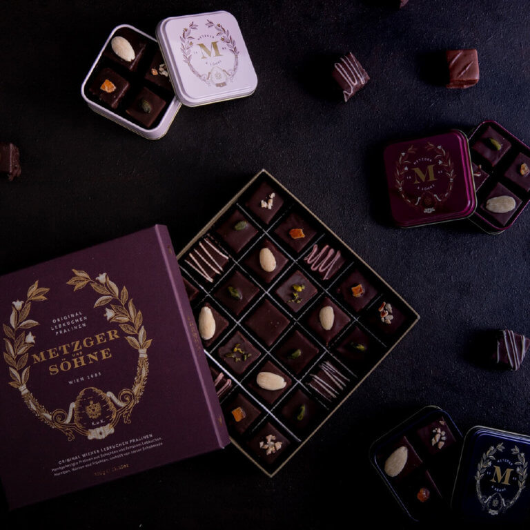
Shaping the history of Viennese gingerbread

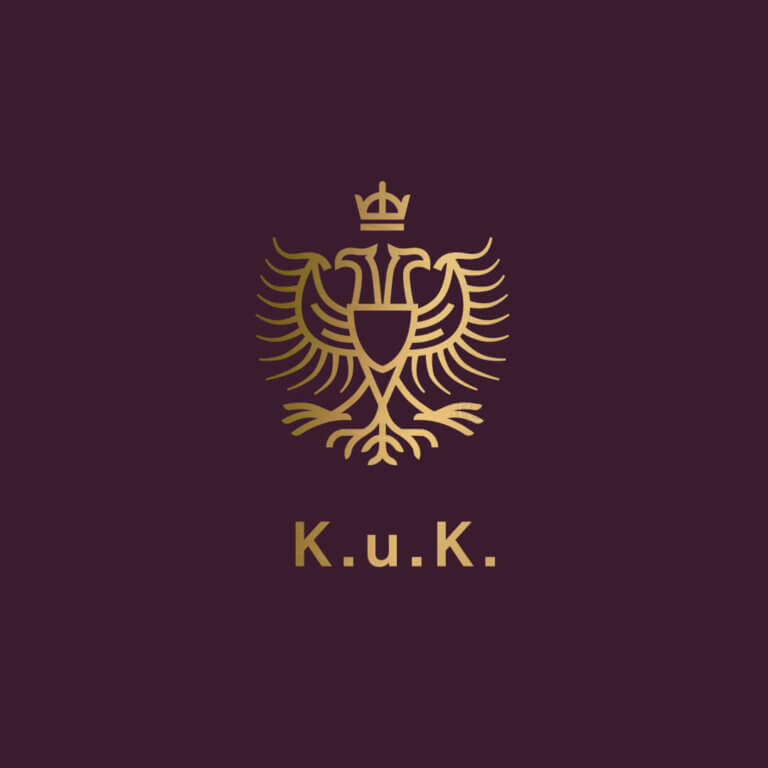
We created the new visual identity and packaging for Metzger & Söhne, who have been making traditional Lebkuchen in Vienna for over 330 years. The unique taste has inspired emperors and kings over the centuries. K.u.K. stands for Kaiserlich und Königlich (imperial and royal) and the title has been awarded to Metzger & Söhne as an Imperial Court Supplier.
Inspired by the neoclassical architecture of Vienna, Metzger & Söhne’s craftsmanship and commitment to the best ingredients, including their star organic Austrian honey, we created a decorative wreath that grows out of an ornamental beehive. This illustration has become a core visual asset for the brand and is used across packaging and marketing materials.
The colour theme is a combination of deep regal reds and blues mixed with lighter pastels adapted from the Viennese fashion and architecture of the time.
The design is timeless just like their gingerbread recipe. For over 300 years Metzger & Söhne have been letting their dough gently mature over a number of months. You can (and we did) taste the difference. Delicious.

Enjoyed this article? We also post our articles on LinkedIn. Follow us to stay up to date.
Follow us on LinkedIn