In awe of excellence - D&AD 2024
This month I had the honour of judging Packaging Design at the D&AD 2024 awards, a truly inspiring couple of days with a brilliant set of co-jurors to debate, scrutinise and have some laughs along the way with.
The D&AD have been a constant and inspirational presence in my career ever since I graduated and exhibited my slightly sticky spray mounted portfolio at D&AD New Blood (more years ago than I now care to remember). D&AD Awards showcase and celebrate the world’s best commercial creativity in design, advertising, craft and production and this year was no exception. As the ultimate standard of creative excellence, it’s also more than an awards, it’s an education charity that invests in the next generation of talent.
With the Pencils now announced I wanted to say a huge congratulations to all the winners. Here were some of my personal favourites for the exceptionally smart thinking and brilliantly executed work.
Viva la creativity!
For Product Design:
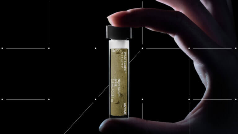
Aizome Ultra by Serviceplan Germany for Aizome
The 1500+ synthetic chemicals used in textile dyeing harm workers, wearers and the environment. While the industry slowly changes, greenwashing prevails. Plants have long been used in dyeing, but without binding chemicals, color and health benefits fade quickly — making it unsuitable for mass production.
AIZOME ULTRA™ is a patented, ultrasound dyeing method. Instead of synthetic chemicals it uses a physical trick: ultrasound sets plant particles in motion at a custom frequency of 52.5kHz underwater, binding them to the fiber permanently. And with that, their color and health benefits.
Link to case study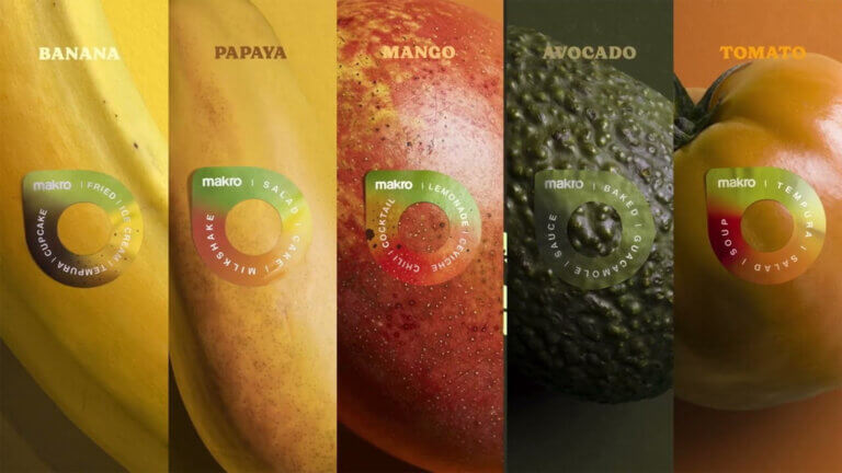
For packaging:
Life Extending Stickers by Grey Colombia for Makro Colombia
According to the Food and Agriculture Organization (FAO) in Colombia 6.1 million tons of food are wasted each year, and 40% of those are fruits and vegetables. As an answer to this problem, Makro Supermarkets set an objective to not only help at their stores, but to educate consumers on preventing food waste.
Using a media that has existed for decades: The Fruit Sticker with a real purpose: extending their life cycles suggesting recipes based on the fruit’s ripeness and color, especially in their most ripe stages cause that’s when people avoid their consumption for cosmetic reasons.
Link to case study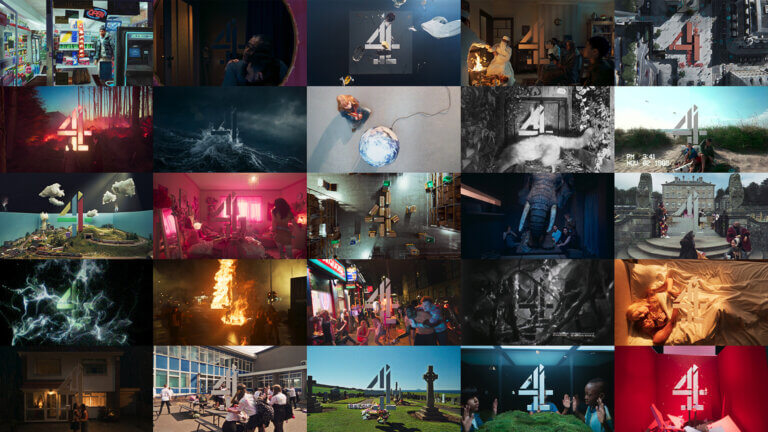
For Art Direction:
4creative Idents by 4creative for Channel 4
Seventeen independent creatives, artists and filmmakers came together in 2023 to create the emotionally colourful tapestry of 25 looping scenes depicting life in modern Britain for Channel 4’s bold brand transformation.
Drawing on the concept of the ‘4’ as a traveller through the truths of the nation, the creative agency interpreted five themes – identity, the land, system, release and love. Viewers dive through the changing idents inside the number four, indulging in live-action, animation and full CG scenes that represent chaos held together by one system.
Link to case study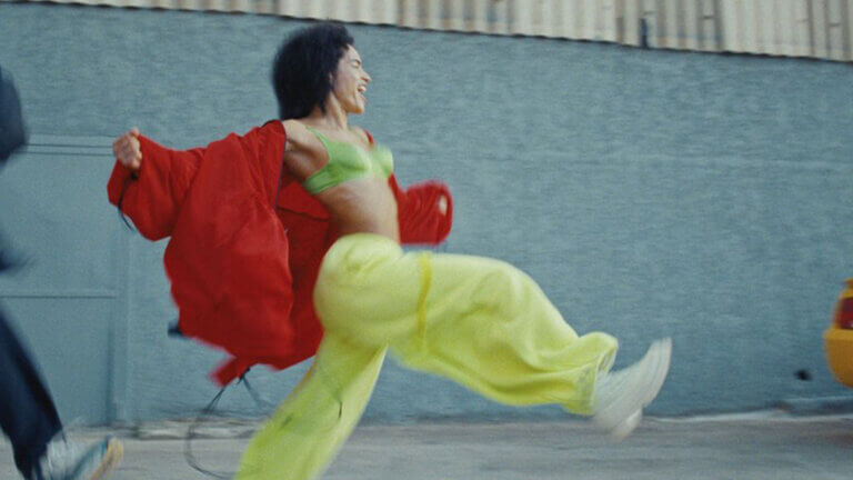
For Video Editing and Cinematography:
Mette – Mama's Eyes by Division for Sony Music Entertainment
Chronicling the origins of Mette’s emergence as a performer, musician, and dancer, stylistically evocative and visually striking shots of Mette performing intercuts with culturally referential footage of sex, birth, violence, destruction, rebirth and celebration, growing increasingly personal as the song continues. By the first chorus, amongst the clips is a young Mette in home videos with her mother. Running counter to stereotypical imagery of mothering, the edit matches Mette’s choreography and lyrics by splicing in old Hollywood dance films, wild animals, and an array of protests.
Link to case study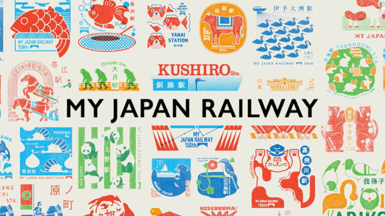
For Illustration:
My Japan Railway by Dentsu Tokyo for JR Group
Japan Railway is well known for its practical convenience and on-time record, but this campaign enabled people to view the company in a more personal context. Using an interactive web app that was specifically designed for rail users, it created a pathway for people to engage in a conversation with the brand.
This effectively turned everyday commuting into a brand experience, changing the way people felt about the company. Besides, it encouraged them to travel by rail to more distant destinations, and gave them an outlet for their creativity as they visited scenic attractions throughout Japan.
Link to case study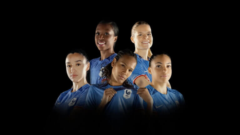
For Digital and Social:
WoMen's Football by Marcel for Orange
Support in football is gender-biased. To encourage the French women’s team before the 2023 World Cup, Orange tricked the fans into loving woman’s football. It first showcased a never-seen-before compilation of top plays by French male stars (Mbappé, Giroud, Griezmann…). Then they reveal the ruse. The video was in fact a compilation of… women’s technical moves! Thanks to VFX, they faked the appearance of the French woman’s team in the 1st part. The 2nd part showcases the same actions, without VFX, allowing the audience to admire the talent of the women’s team, free from gender stereotypes.
Link to case studyWritten by Bryony Meyrick, Partner and Creative Director
Put a Spring in your step!
Solving Challenges in Capital Markets
Enjoyed this article? We also post our articles on LinkedIn. Follow us to stay up to date.
Follow us on LinkedIn