No tricks,
all treats
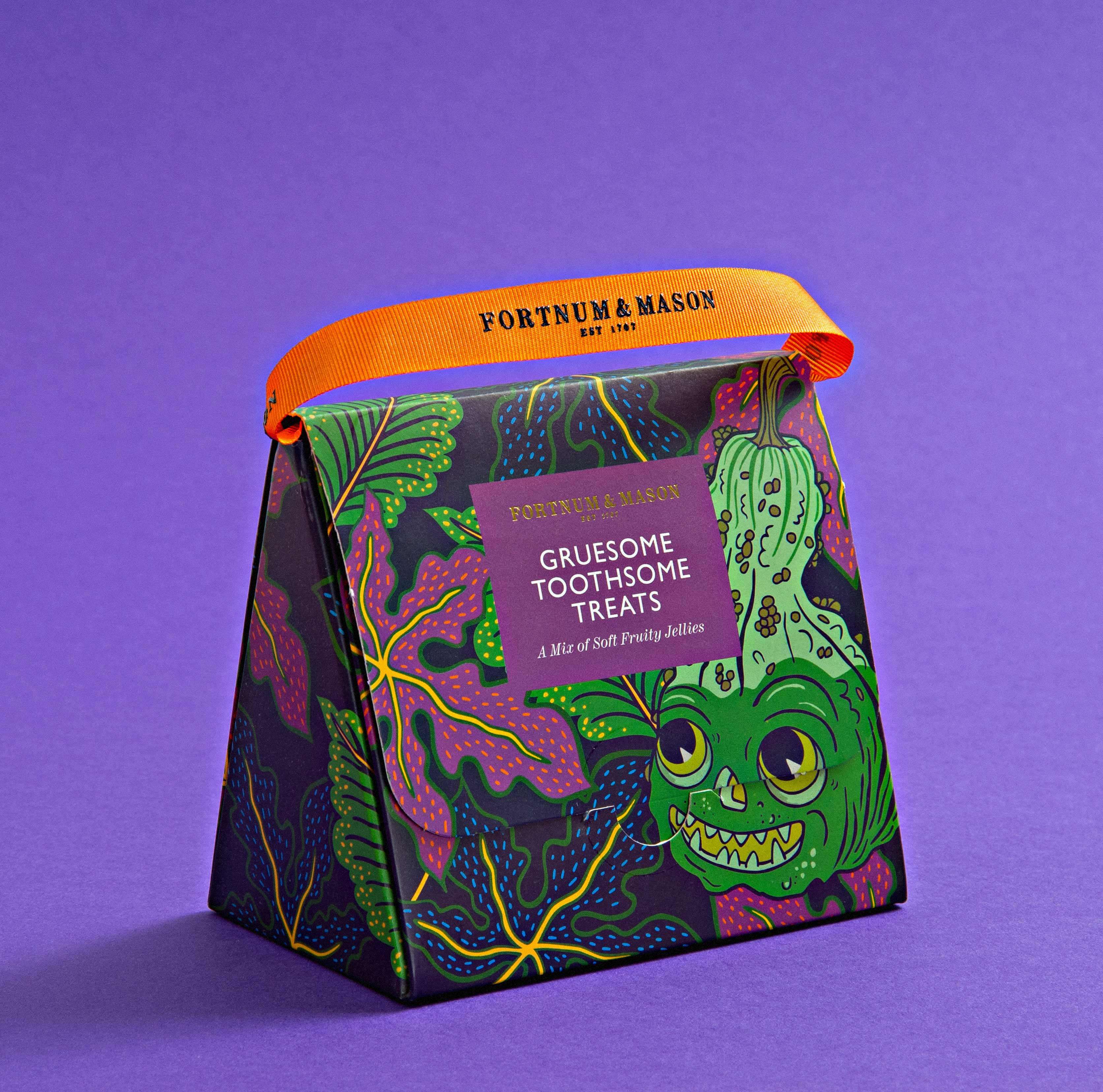
We've long admired how Fortnum and Mason delicately balance their rich heritage with a dedication to the experimental and contemporary. Their signature brand feel reflects their proud history of working with interesting artists and illustrators through the ages.
- Packaging
- Illustration
Halloween reinvention
Fortnum and Mason have celebrated Halloween with their exclusive range for 15 years and they’d been running their current design for the past four years. Fortnums wanted to completely reinvent their offering, making the range more sophisticated and appealing both to families and Fortnum and Mason’s discerning core customer base.
Pumpkins take fright
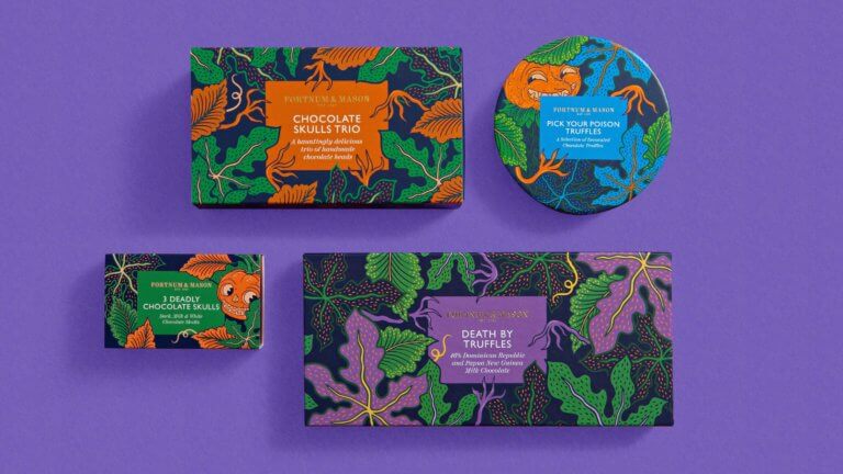
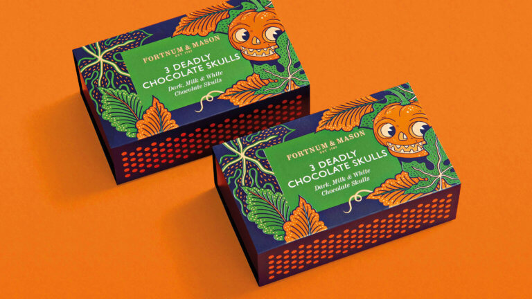
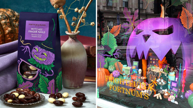
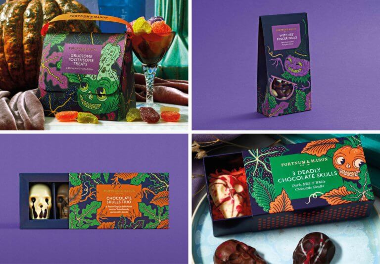
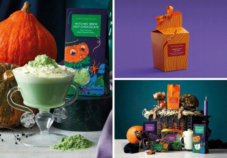
We were commissioned to create a packaging concept for the Halloween range considering everything from tea to chocolate and confectionery, creating a comprehensive design system. Creative product names inspired visual cues and we leaned into the emerging trend of decorating with gourds for Halloween, adding character to make them quirky and personality-rich. Our theme of ‘pumpkins and gourds in all their eccentric shapes, textures and sizes’ gave us a flexible design system across multiple packaging formats.
Keeping it on brand
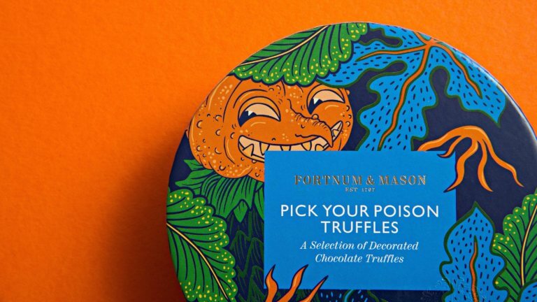
The spellbinding Halloween range is designed both to fright and delight. Illustrated in house in autumnal colours and accompanied by natural details such as leaves and branches and, on closer inspection witches fingers creeping out of the undergrowth, the pumpkins and gourds turn into mischievous witches, skulls and imps. Our illustrations incorporate Fortnum and Mason’s typography and retain the brand’s trademark wit.
Illustrated by our talented collaborator Kate Larsen @katelarsen_illustration.
Need a scarily good packaging concept?
Get in touch