Tennis in an English garden
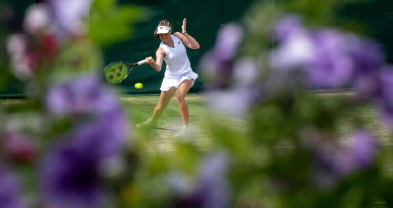
Iconic summer events like Wimbledon have a great opportunity to showcase their food and drink offerings and elevate the experience for their audience. Our brief was to unite Wimbledon's food and drink offerings with the wider Wimbledon experience of 'Tennis in an English Garden’.
- Brand strategy
- Range architecture
- Naming and messaging
- Visual identity
- Styleguides
- Packaging
- Marketing
- Campaigns
- Illustration
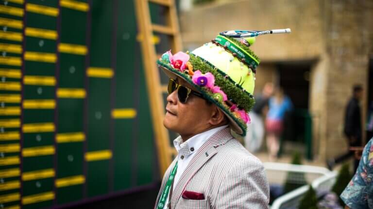
Tennis in an English Garden
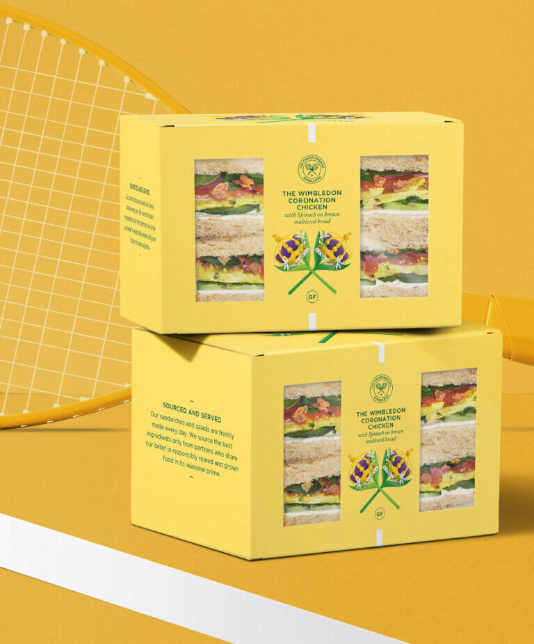
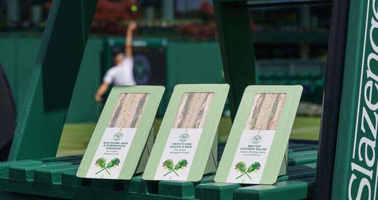
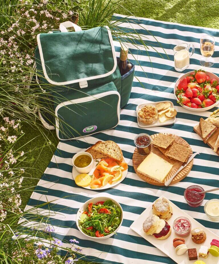
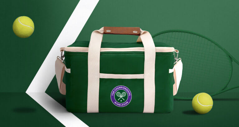
A visit to Wimbledon is rich in quality, heritage, and plenty of fun facts, something which should also be evoked in their food-to-go offerings. We developed the overarching creative vision for Wimbledon’s food and drink experience and translated that vision into a packaging design system for strawberries, sandwiches, wraps and salads, and refreshed their iconic picnic bags, rucksacks and blankets for Wimbledon’s on-site and at-home picnics.

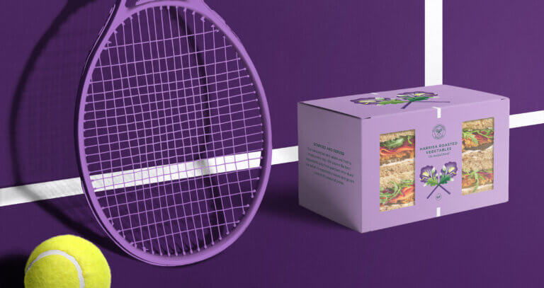
Served with joy
Our creative vision, ‘Meticulously crafted, served with joy’, highlights that food and drink at Wimbledon is a joyful feast of the finest flavours. It is the result of countless hours of dedication, meticulous attention to detail, and care, just like the tennis itself. The menus are crafted to embody the essence of high summer al fresco dining, lovingly curated to complement Wimbledon’s fabulous setting with its fresh summer breezes, warming sun, cooling shade, and well-tended lawns and gardens.
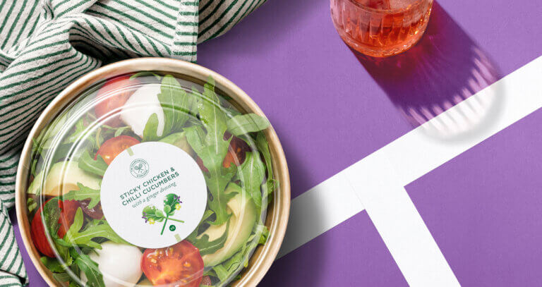
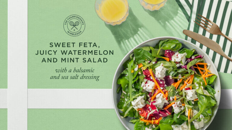
The Wimbledon crossed racket
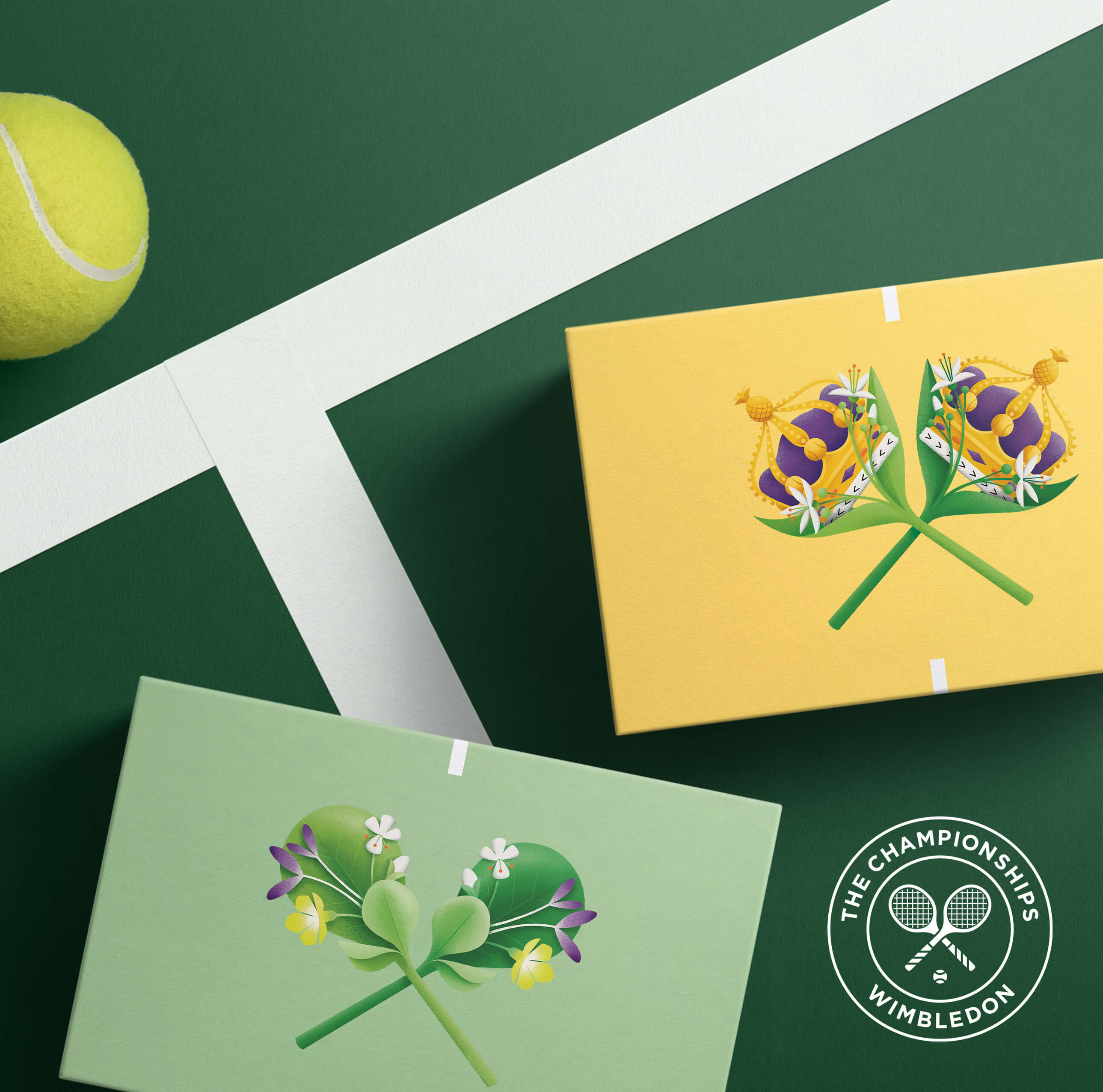
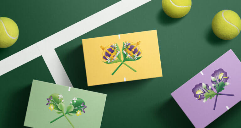
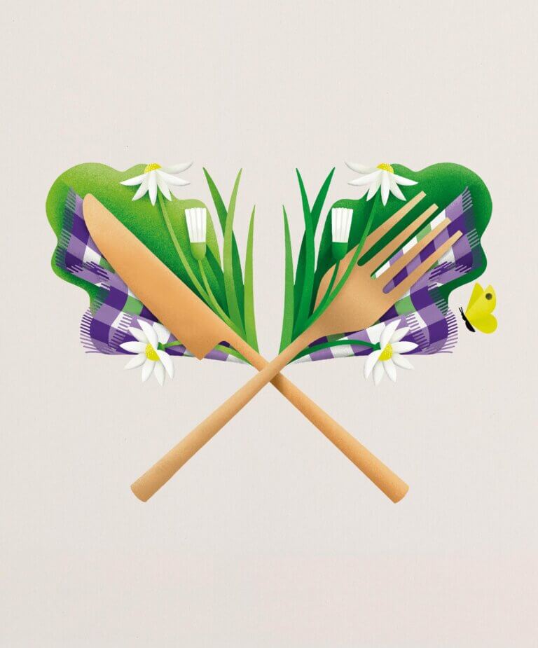
To enhance the Wimbledon experience of ‘Tennis in an English Garden’, we incorporated the crossed racket motif, synonymous with Wimbledon, to express the stories of food and drink at the event. The motif illustrates the freshest strawberries and ingredients in meticulous symmetry. This flexible device was also used to highlight various picnic offerings and limited edition ranges on site.
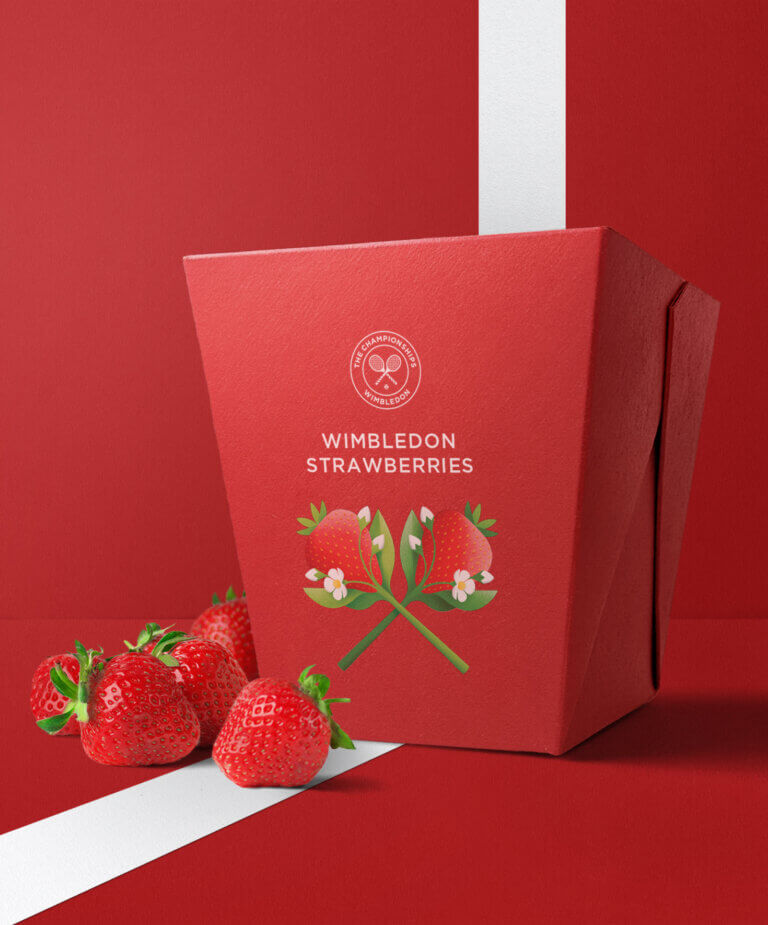
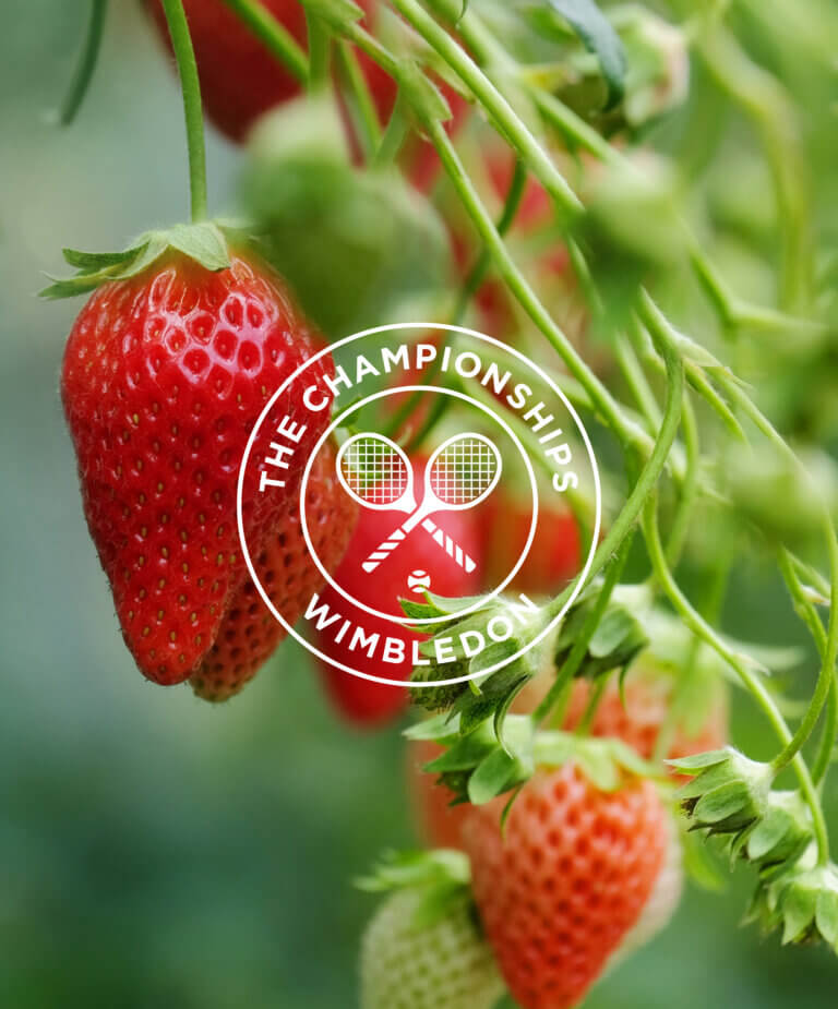
This smallest Wimbledon Hero
Enjoys the longest Championship reign;
Fresh from a Kentish Garden
Farm-tended and dawn-picked today;
Hand-hulled, sized and taste-tested
Only bite-sized make the pass;
Cream-soaked or scoffed solo
Each one pure match-watching class. Campaign poetry:
The iconic Wimbledon Strawberry
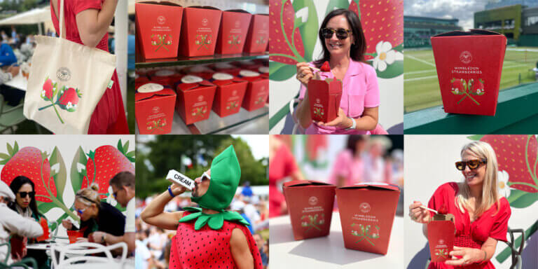
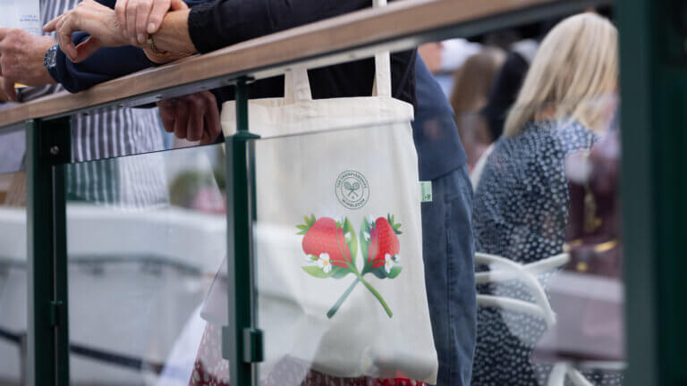
Navigating with speed and ease
By understanding the demographic and preferences of Wimbledon’s guests, considering factors such as age range, dietary preferences, cultural diversity, and local tastes, we proposed a range naming strategy that complements the packaging design, making it easy to navigate and emotionally engaging in a fast-paced and space-limited environment. The focus should be on speed and ease, allowing everyone to quickly return to enjoying the tennis and having fun. We introduced messages about provenance and sustainability, as well as fun food facts, bringing joy into the copywriting and telling stories through poetry.
Our on-going relationship
We created a wealth of visual assets and guidelines, encompassing packaging, messaging, photography guidance, and an image library. Now in our second year, we are rolling out the creative vision across the environmental experience and customer journey, incorporating signage, large-scale graphics, A-boards, digital screens, floor decals and POS.
