MOMA Foods

MOMA Foods
From challenger brand to oat category leader.
The Solution
Rooted in the new positioning, ‘Oats Made Extraordinary’, the rebrand focused on elevating the perceived value of oats by showcasing their versatility, quality, and flavour.
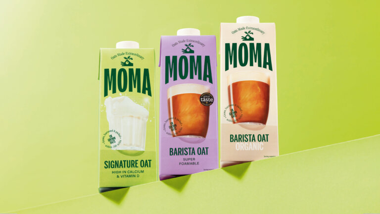
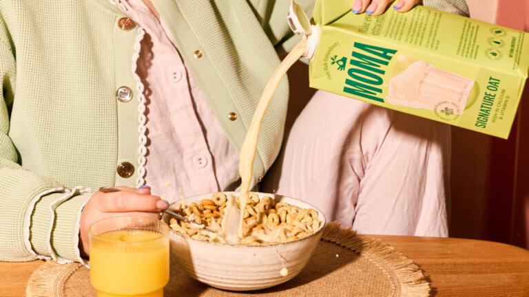
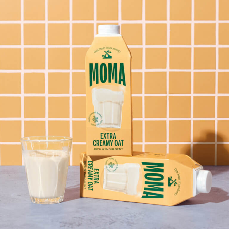
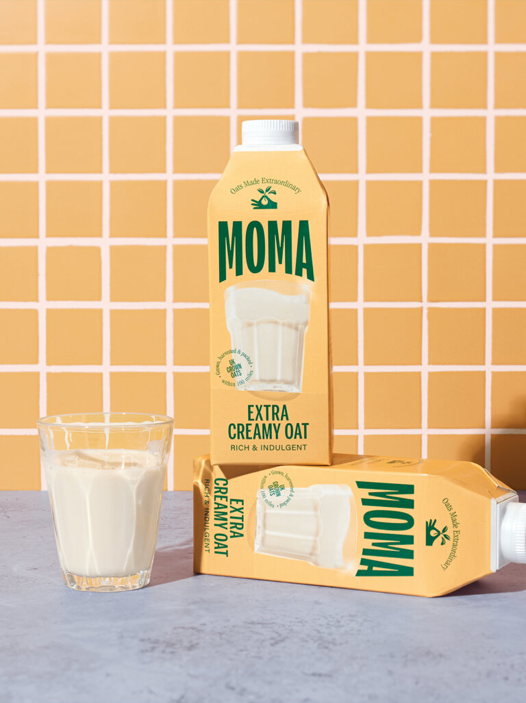
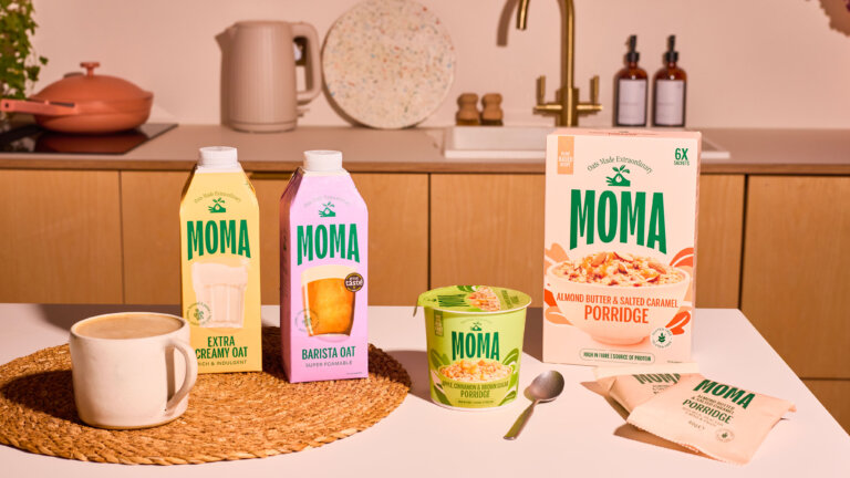
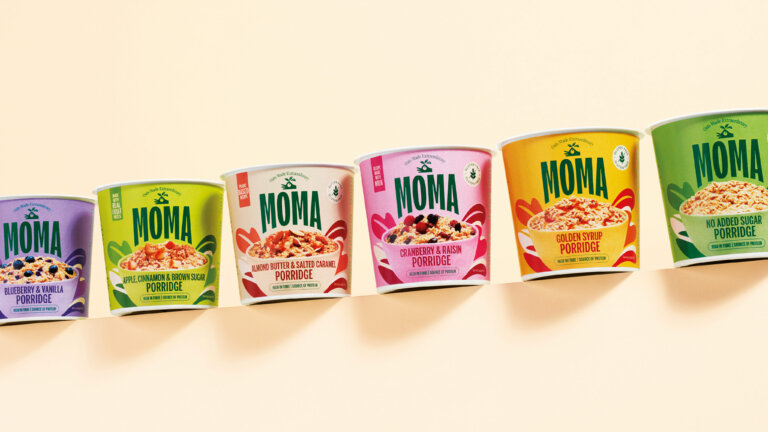
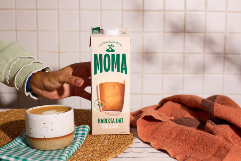
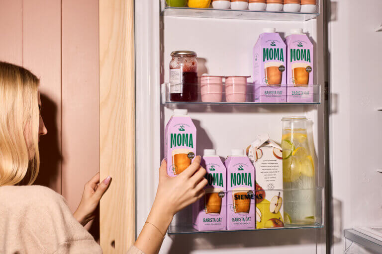
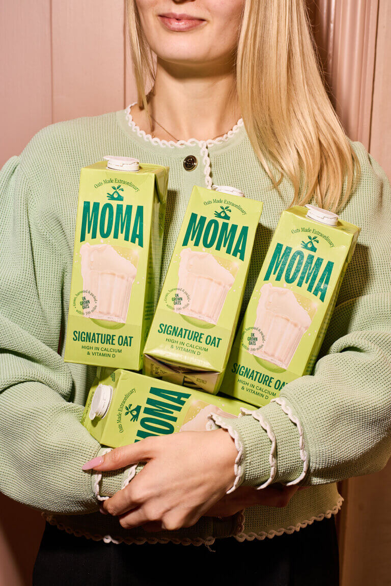
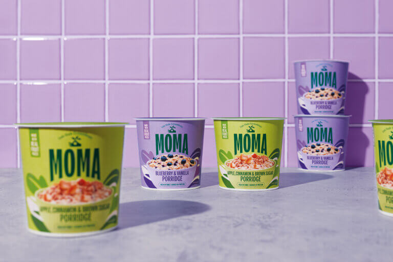
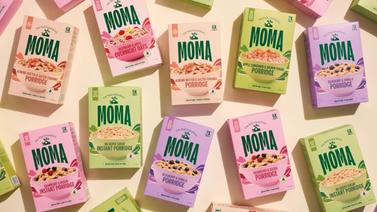
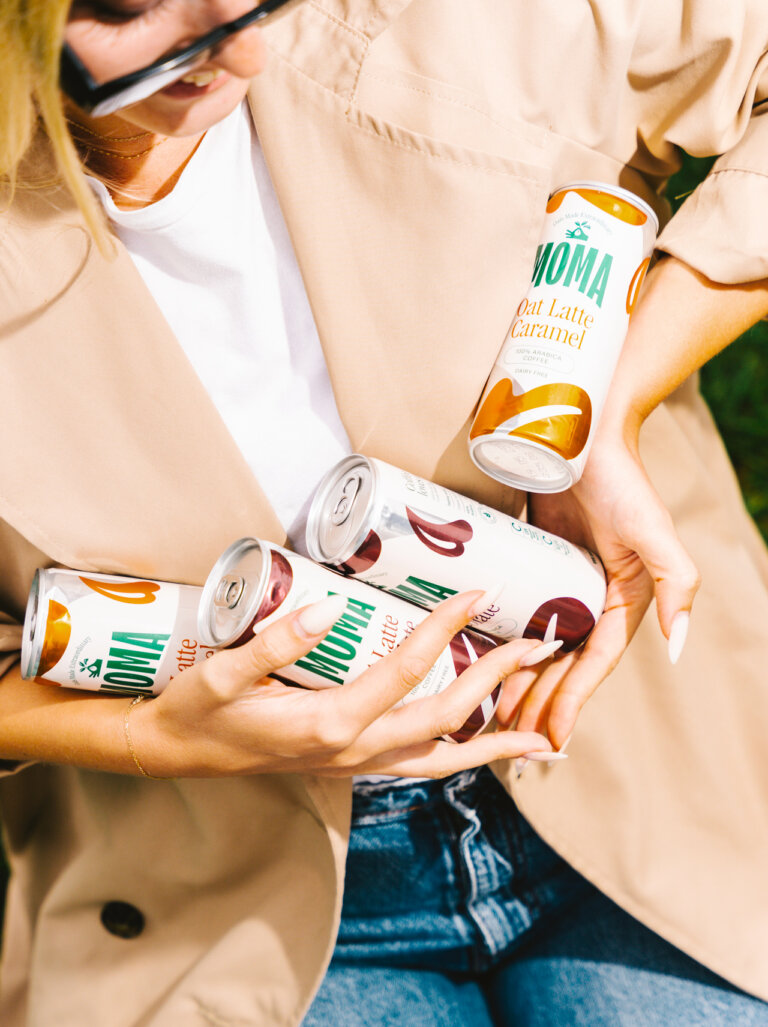
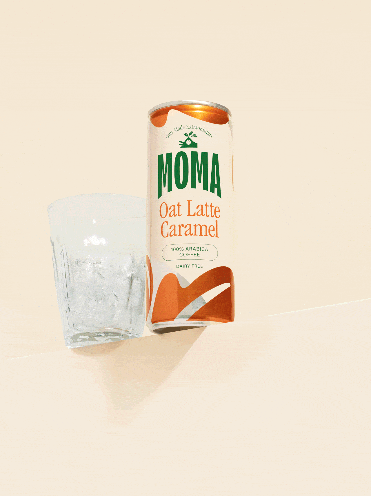
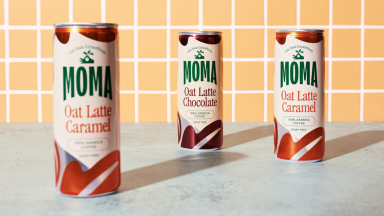
We introduced a new logo, strapline, and symbolic brand mark featuring a hand holding oat grasses, an emblem of the brand’s craft and connection to its ingredients. To emphasise taste and increase shelf standout, each oat drink was prominently displayed at the centre of the packaging. This approach not only created an iconic visual signature but also made it easier for consumers to navigate the category.
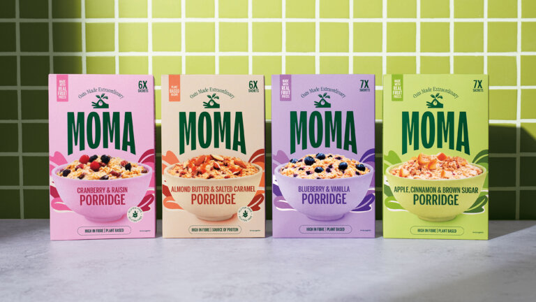
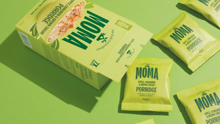
The brand’s commitment to quality was reinforced with a ‘farm to pack’ promise, highlighting that all oats are grown, harvested, and packed within a 100-mile radius. A refreshed colour palette and tone of voice were designed to balance health credentials with vibrancy and authenticity. Alongside this, we developed a full visual toolkit, spanning iconography, photography, digital content, packaging, social media, POS, and FSDUs. Comprehensive brand guidelines and a flexible design system empowered the MOMA team to maintain consistency across every touchpoint.
The Impact
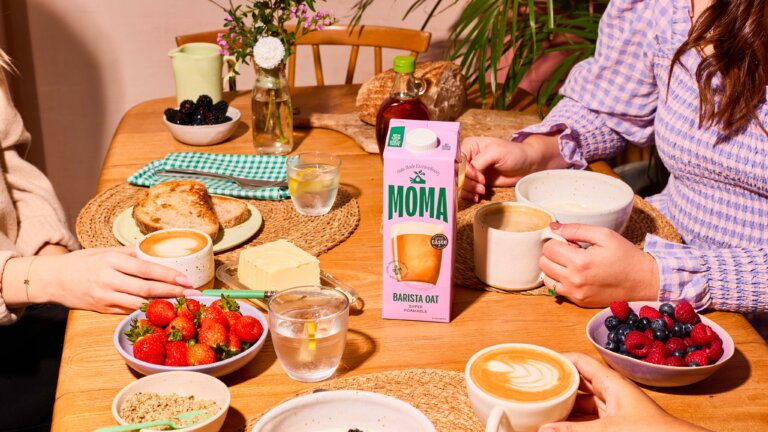
Following the relaunch, retail sales rose by 22%, reflecting stronger shelf presence and renewed consumer interest. MOMA successfully launched ten new products, including oat milks, porridge sachets, and iced coffees, expanding its presence across categories. MOMA’s oat milk has become a go-to choice in the specialty coffee scene, with 72% of consumers choosing it for its quality and performance. The impact of the transformation was recognised by the industry, earning a Fab Award.
"Together Design London's creativity, expertise and collaborative energy made all the difference." Helen Pomphrey, Marketing Director MOMA Foods
The redesign was rolled out across wholesale, foodservice and speciality coffee shops.
Read article here
Deliciously Ella